Inspired
Media
Mechanics
Wide Eyed Communications is a boutique advertising and marketing agency with a comprehensive slate of services. We offer personal, client-focused services that are both flexible and affordable. Our mission is to provide distinctive creative, dynamic marketing strategies and quick turnarounds that excel within budgets of any size.
KeepRite Refrigeration
We’re proud to have worked with KeepRite Refrigeration for over 10 years.

10+ year
client relationship

168%
avg. growth per year
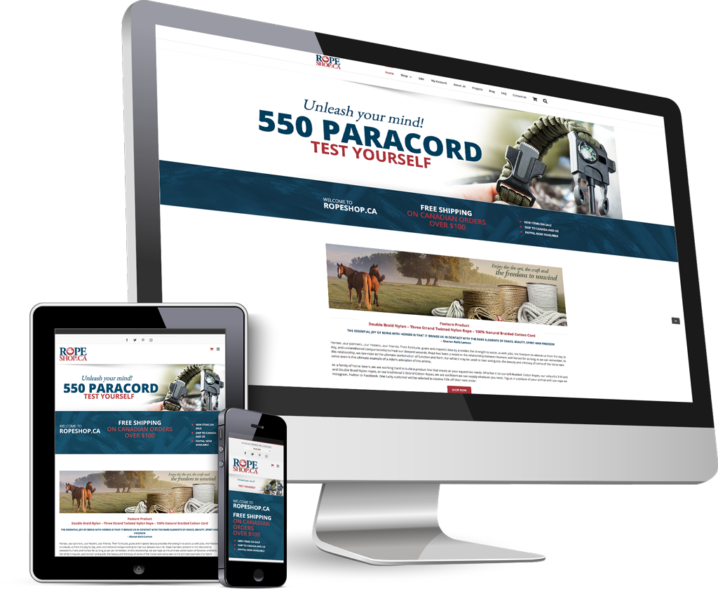
Ropeshop.ca
We developed and designed the leading ecommerce rope store in Canada, with a Google Adwords campaign to match.
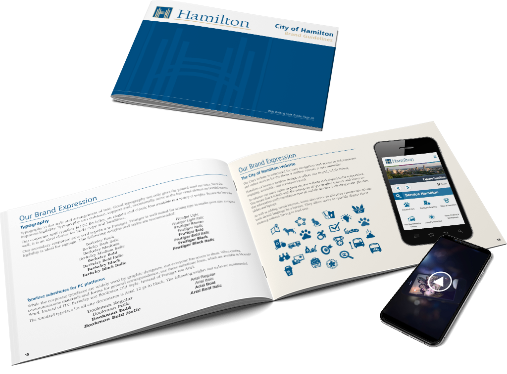
Corporation of the City of Hamilton
We’ve helped departments throughout the city communicate and engage with residents, businesses, and investors.

250+
successful projects
My, what big “Tee’s” you have, or…why your type is too small.
June 25, 2018You may have noticed that the font size on our new site is larger than you'll typically see on most websites. That's a deliberate choice on our part. In 2012, approximately 3% or about 750,000 Canadians reported having some limitation in their sight. Beyond that, at age 40, only half the light gets through to the retina as it did at ...
Wide Eyed has helped our clients improve their communications and grow their businesses. Contact us at 905-818-5728 or email Mark Draak and let’s get started.
